What is the problem I am trying to solve and what are my goals?
Project Description:
For this project, my goal was to create a user-friendly airline aggregator application that would make the travel booking process seamless and enjoyable for young adults. After conducting extensive research, I discovered that most users find traditional travel applications too confusing to use on a small screen, and prefer aggregator websites instead. Therefore, I decided to design an aggregator app that would be named "The Goose," inspired by geese who migrate long distances. I aimed to create a fun and interactive app that users could easily navigate, while also incorporating a recognizable character or logo to increase brand recognition.
To ensure the success of the project, I conducted benchmarking, surveys, and user tests to collect data and insights before starting the design process. I worked on the project independently for six months, from April to October 2021, dedicating the first few months to research and data collection. During the design phase, I used various software tools such as Figma, Sketch, PowerPoint, Adobe Photoshop, Miro, Hand Mirror, and Reflector.
The primary objective of this project was to make the travel booking process fun, simple, and accessible for young adults. By creating an aggregator app that is easy to use and navigate, users can quickly find and book flights from their mobile devices, eliminating the clunkiness of traditional travel applications. Through user-centered design and careful consideration of user feedback, I aimed to make The Goose a popular choice among young adults for all their travel booking needs.
Let's look at the competitors
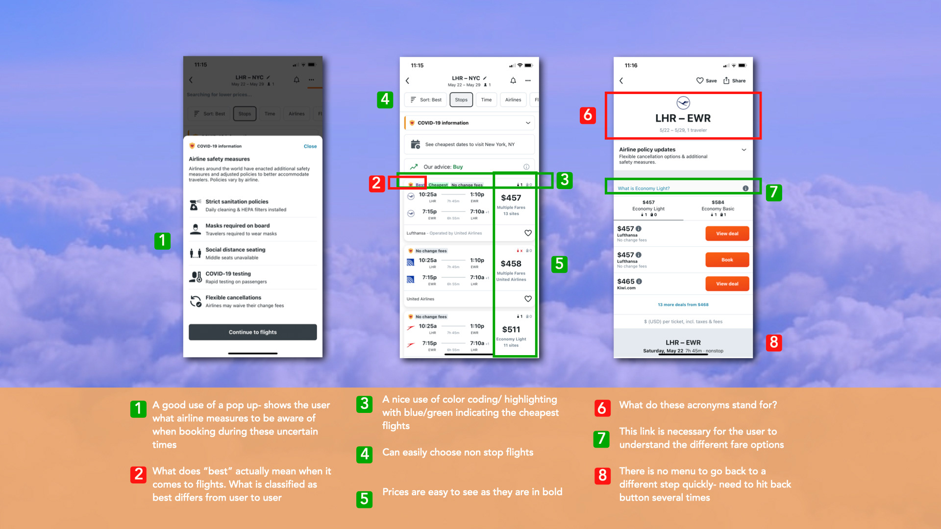
I conducted competitive benchmarking to better understand what was already on the market. I chose a mix of best in class aggregators and companies that are used by the majority of travelers *Skyscanner/Kayak/British Airways/JetBlue. I used these apps because they are familiar brands that have a large volume of users and see high profits.
My main objectives were to find out the following:
- Understand the conventions to follow
- Highlight best practice that should be emulated
- Find possible pain points
- Analyze the homepage and booking pages in depth
- Find the strengths of each app
- Understand key elements and features
Through my research I came to some very important conclusions:
- It is important to use color and font to make the information clear to the user
- The simpler the date input the better
- Safety measures are seen on most websites
- Simple and easy to flow through navigation
- Keep the app simple and fun - not cluttered
- Make layovers clear


I gathered insights directly from the source - the general public - to better understand their booking habits and preferences. Through a survey distributed to a diverse group of participants, I was able to gather invaluable data that guided the development and design of my app.
Here's what I set out to learn:
How do consumers typically book flights? (Webpage or mobile app)
What factors are most important to consumers when booking?
What aspects of the booking process should be prioritized?
How has the current climate affected people's attitudes towards travel?
To recruit participants, I tapped into my personal network, as well as social media channels. I used SurveyMonkey to easily distribute and collect data.
Here's what I discovered through the survey:
- Most people prefer to book their travel through a website rather than a mobile app.
- Due to COVID, people are not traveling as frequently or checking for travel as often.
- Smooth booking processes, minimal layovers, price, flight times, seating, legroom, and airport location are the most important factors to users when booking travel.
- Users would like easier access to information about baggage allowances before making a reservation.
- Users want to be able to search for flights with stopovers.
- Users want travel apps to be more user-friendly.
- Users want travel apps to be clearer about which days flights are available, and not allow users to book flights that aren't available.
- Users want to know about safety measures before booking their travel.
By gaining insights directly from the public, I was able to create an app that meets the needs of users and provides a seamless and enjoyable travel booking experience.
How do users flow through best in market aggregator apps?

Before beginning the design of the product, I did 3 testing rounds in order to reveal possible usability problems with best in market aggregator travel apps.
I was aiming to find out what users pain points were.
I tested the user from the home-screen all the way through the booking process.
I tested young adults and professionals, finding users by posting a recruitment screener
How did I recruit users?
I recruited users using social media and friends of friends or family. I did not want any bias so the surveys were submitted anonymously.
How did I conduct the usability tests?
I did an in person usability test using an iphone as well as an imac - recording the screen and usability test with Quicktime player and mirroring the iphone onto the mac using two different apps (handmirror and reflector).
I made sure to rehearse my set up several times before each usability test as to create a seamless experience
I had a usability script for my own reference as to not miss out on key information I needed to relay or find out from the user. (Such as background information and the example scenario I wanted them to flow through)
I had each user sign a consent form before beginning - this gave me permission to record the usability test to use for future research
Problems that arose during the test
As with all usability tests you do not want to tell the user what to do directly and do not want to follow too rigid of a test script
I perhaps asked too many leading questions at first
What did I learn?
I learned that users are very interested in knowing everything up front- for example, if a flight includes a stop or is a nonstop flight? I also learned that simplicity and ease of use are key.
Users pain points included :
- The fare breakdown and the inbound/outbound flight display. Users wanted the fare options displayed at a glance in a more obvious location as if they did not have to think about them they might be more inclined to select them and pay extra money.
- The apps were cluttered
- Users were unaware they selected a layover with Eurowings
- The main screen had too many features *some of which were unnecessary as they performed the same task.
- Finding out about layovers late in the booking process ruined users experience
Users positive points
- Memory feature was helpful and saved user time
- Clarity of fare breakdown on Eurowings made the user more inclined to book a more expensive ticket.
- Being able to choose a city with a scroll or by typing the first letters of a city saves user time
- Easily chose number of passengers using the plus sign.
- The different colors of flights helped the user to better catagorize
How will I use this information going forward?
- Make sure to make layovers as clear as possible from the beginning
- Create an app that remembers past searches
- Enable GPS location
- Keep things simple and easy to read


Looking at the data.
The main purpose of the affinity diagram was to see any navigation problems the travel apps may have had.
I used an in-person card sorting process- first presenting my research to a group of people and then asking them to digest the information and put the key findings onto post it notes.
Participants grouped the information into various pain points and behaviors. (Some examples seen below)
- Seat selection preference
- uncluttered homepage
- flex options
- member access
- date input
- location input
- far breakdown
- User painpoints
- Direct/non stop flights
- unavailable flights
- Price
I learned the key elements that are of most importance in the booking process as well as the positive and negative interactions
With this research I knew that I wanted certain things to be very clear to the user as to cause no confusion and to make the booking process seamless.
- Date input needs to be easy
- Create a simple homepage
- Do not display unavailable flights
- Color code information on flight display page
How did the customer interact with the app?
To understand how customers find and interact with the service I created a Customer Journey Map. With the customer journey map I was mapping out the customers journey from start to finish using the affinity diagram. The users realized a need for the solution by the flight booking page. My customer journey map shows the main pain points felt by the users and where. (Not knowing about layovers) My customer journey map also takes you through the users emotion during each step in the booking process. Many users felt that the apps were too busy and unclear. I decided to make my app as simple as possible to fix these issues. Since I also wanted the app to be fun I had the idea of adding an explore option for the user to find a place to visit based on budget.
Simplifying the flow
In this project I created a flow map that listed out the 3 flows available in my app. I detailed the screen states and the user interactions. This flow map helped me when designing my screens. I was also better able to see any problems within the flow. (one of which was going from the account screen back to the book a flight screen)
This flow diagram was not put together in one go! I had at least 4 different iterations- constantly changing and molding using the data I obtained through weeks of research. It took a long time to include all of the elements I felt were necessary from my research
What were some changes I made along the way?
- I added baggage (I left this out at first!!)
- I added a connection between the my account screen and finding a flight
- I added the necessary steps in the top flow by using the main flow for reference
Lets jot this down
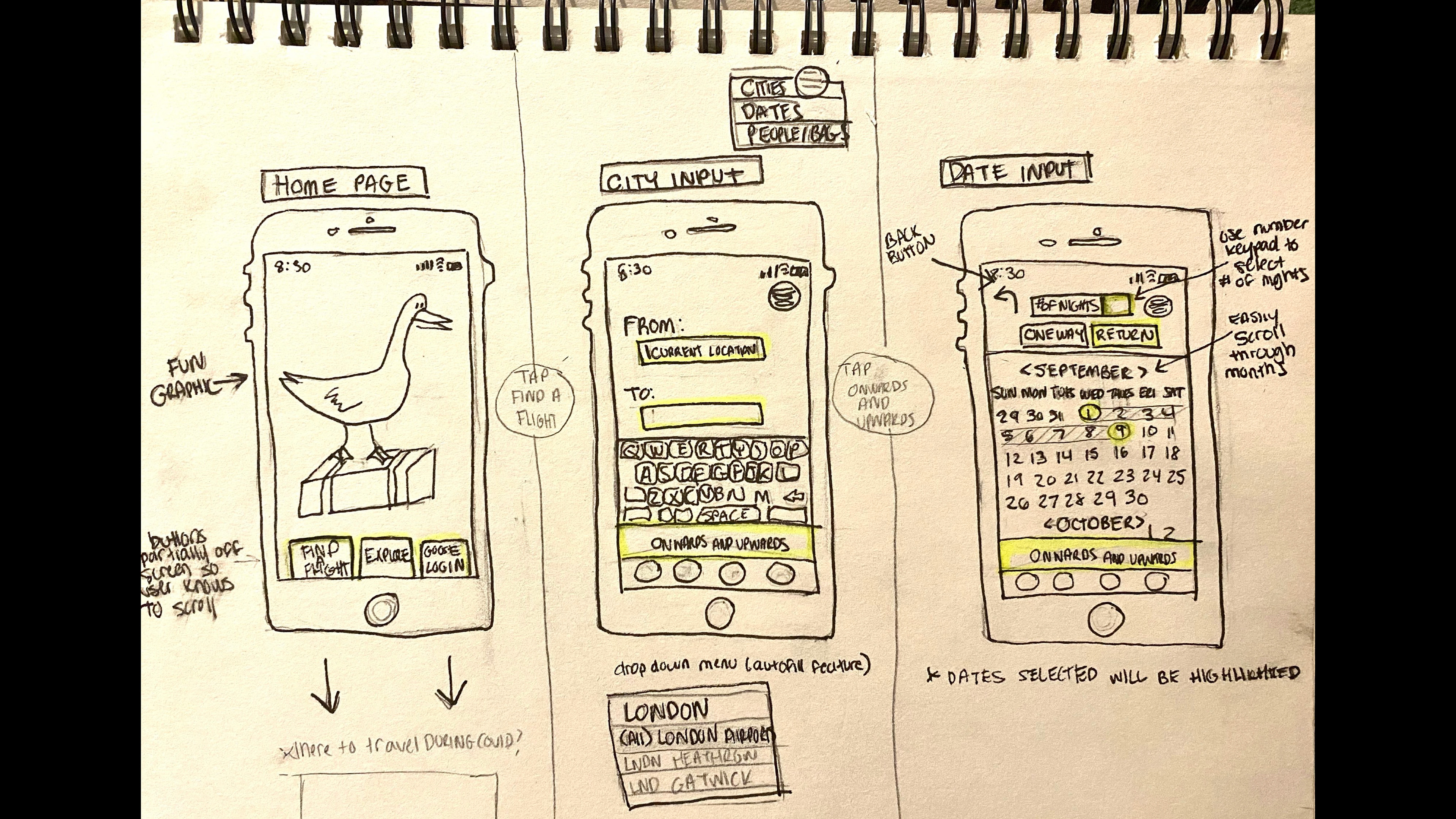
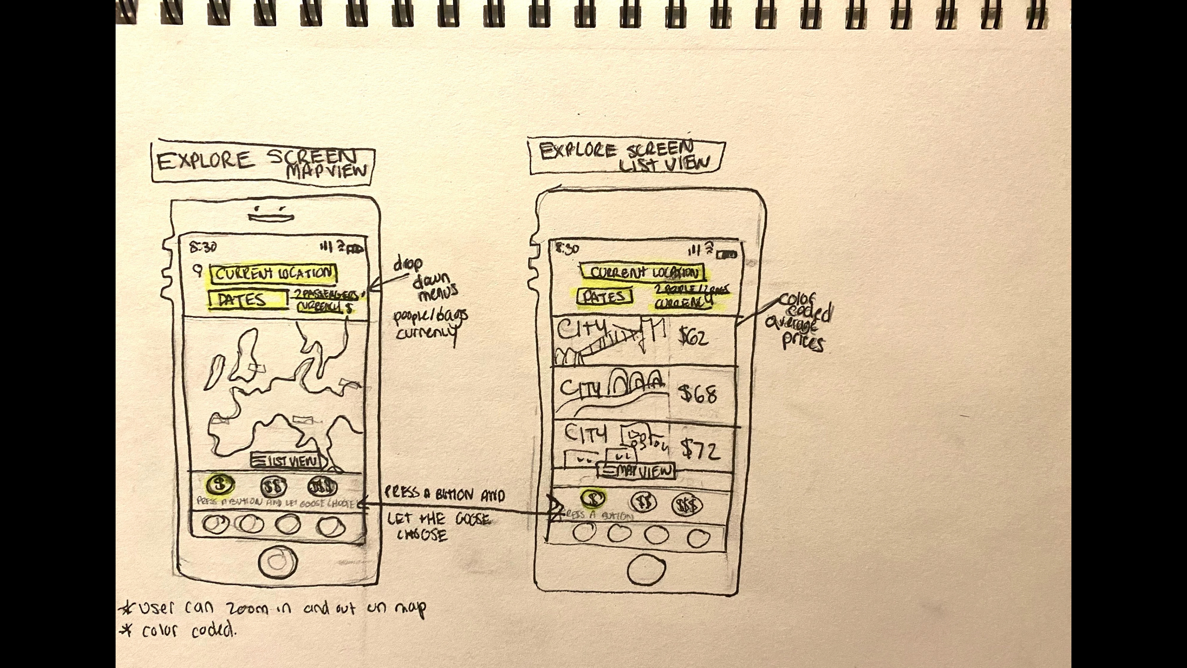
- I usually start the design process with low fidelity wireframes. This is the way I iterate through many design options quickly
.- The main purpose of my design was to better understand the flow and where various information would fit in.
- I learned that my users preferred apps that were simple and easy to navigate, with this in mind I kept my interface simple with not a lot for the user to process (breaking the booking process up into parts)
- I went through several different versions before coming to the final drawings- I was constantly going back and forth between the users mental model and the sketches.
- The main differences between my different versions were the information I felt was needed on each page- with each drawing I realized some pivotal information was missing
- I arranged the key buttons to be located on the screen where a user can easily see and tap them


How fun! Let's interact and see how we get on
My prototype is meant to showcase the app as well as some of my UI skills. It takes you through the basic three flows and enables the user to interact with the various different buttons and the ability to book a flight.
I designed the medium fidelity prototype using Figma


Conclusions
Learning and improving is an essential part of the design process, and it was no different for me when developing my travel booking app. While I had some concerns initially about incorporating all the necessary information into a simple and user-friendly app without overwhelming the user, I persisted and learned a lot along the way.
Through several iterations and by keeping in mind the insights gained from my research, I was able to improve my app in the following ways:
- Added essential information like baggage and COVID safety measures to the main screen
- Simplified the flight search screen with color-coded options and easy-to-read information
- Developed a straightforward date input feature and added simple icons for adding passengers and baggage
- Included a screen with detailed flight information in a larger font, allowing users to double-check their selections before payment
- Used triangulation to validate trends from multiple research sources and perspectives
- Combined my passion for UI and UX to create a flashy and fun travel app that keeps the booking process simple and enjoyable.
- As this app was designed to be an aggregator, I recognized that some features like credit card information and seat selection could be removed as these details are typically selected through the airline website once the user is redirected.
Overall, I learned a great deal from the process and am confident that the final product reflects the needs and preferences of users while also being engaging and visually appealing.
